Style book
Brand
The wordmark, the app icon, station lockups, the link card, and every icon the app draws, taken from the code.
Logo
Bytestream has two product marks, each with its own underline in now. The wordmark is the word BYTESTREAM in Barlow Condensed 600, uppercase, in paper; its underline is FREEDOM in Morse, exactly as wide as the word. The app icon is one B in the same face, paper on void, standing on eight equal bits: a byte. Original numbered stations add a third family: Station lockups, below. The wordmark and the B stay paper.
src/ui/Wordmark.tsx renders the word with the wordmark text role in src/ui/Text.tsx: 28px, 3.4px tracking. Chrome.tsx sets 34 on the rail and Watch.tsx sets 22 when the phone header is short. No code sets it smaller than 22. Everywhere in the app the wordmark stands alone, with no line under it.
Clear space: at least 0.7 × the wordmark’s size on every side, measured from the lockup: the word and its Morse line, or the word alone where it is set without the line. The desktop rail sets it: 24 on the sides, 28 above and 24 below at 34px. Smallest wordmark: 22px, the short phone header. Below that, use the app icon. src/ui/Wordmark.test.ts fails if the word stops fitting between the rail’s insets. Rules locked 2026-09-24 (design/patterns.md, Logo).

docs/images/wordmark-dark.svg · paper, for dark grounds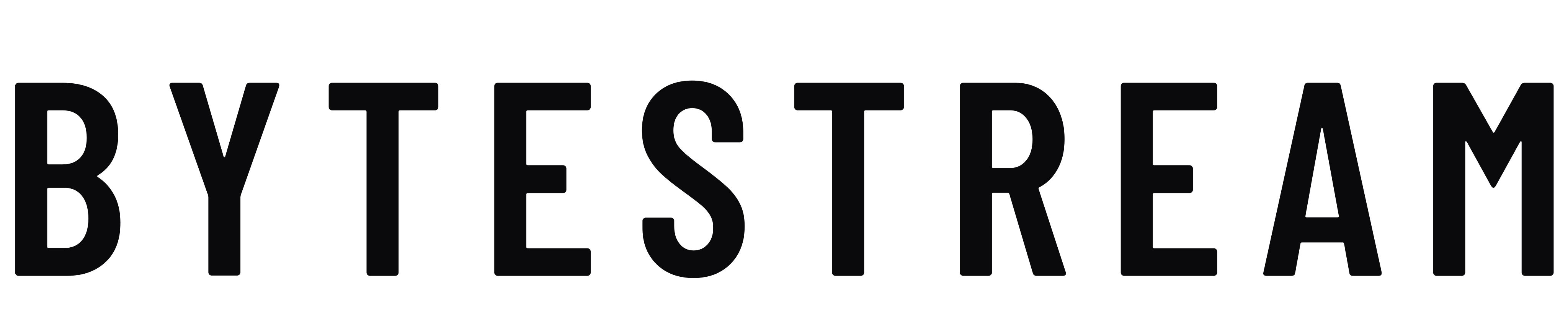
docs/images/wordmark-light.svg · void, for light groundsThe letters as outlines, for places that cannot load the font. The docs site uses them for its header in dark and light mode (docs/docs.json). The app itself sets live text.
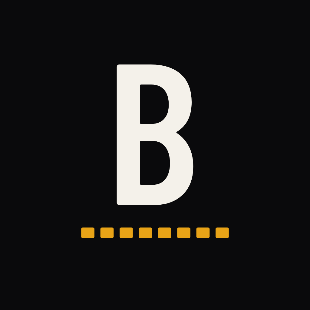




| Source | scripts/make-icons.mjs draws every file from the same BarlowCondensed_600SemiBold.ttf the app loads. Amber is 1.1% of icon.png by pixel count. |
|---|---|
| Ground | Flat void, opaque, no gradient or grain. The splash art is the one transparent file; the splash paints void behind it. |
| Fit per mask | Each file is fitted to its own mask, never scaled from another. Height of the B and its byte: 56% in assets/icon.png (iOS), 58% in public/icon-1024.png (web, 80% circle), 44% in assets/android-icon-foreground.png (66 of 108 dp safe zone), 62% in assets/splash-icon.png, 72% in assets/favicon.png at 48. |
| Android layers | A flat void background layer, the foreground above, and a monochrome layer in white that the system tints. |
| Small sizes | The B keeps eight separate bits down to 32px; make-icons.mjs snaps them to whole pixels there. At 16px the byte is one bar. |
| Every site | bytestream.tv, docs.bytestream.tv and design.bytestream.tv show this one mark in the tab. make-icons.mjs writes every favicon: assets/, public/, docs/images/ and design-site/public/. |
 The wordmark: FREEDOM in MorseThe app icon: the byte
| Under the wordmark | FREEDOM in International Morse: ..-. .-. . . -.. --- --. Dit 1, dah 3, 1 between marks in a letter, 3 between letters: 61 units. A dot is a circle one dit across; a dash is a stadium 3 dits long and 1 dit tall with fully round ends. Every mark sits on one centreline. The line is exactly as wide as the word, so a dit is the word’s width ÷ 61. The centreline sits at the baseline + 0.32 × cap height + half a dit. Colour now. |
|---|---|
| Under the B | The byte: eight equal bits in now, 1.05 × the B’s cap height wide, each gap 0.45 of a bit. Eight separate bits down to 32px, one bar below that. |
| Drawn by | scripts/make-og-card.mjs draws the Morse line, on the link card and alone with --lockup; this page’s lockup is that file. scripts/make-icons.mjs draws the byte. Neither is drawn by hand. |
- Link cards with no picture of their own: the homepage, the docs, the style book
- Marketing material
- The homepage, as a marketing page
- Brand pages, like this style book
- The sidebar rail and the phone headers
- Channel pages, creator and Room pages
- Overlays and the Studio
- Every other screen in the app
Locked 2026-09-24. Picture link cards (a channel, a live, a video, a Room) carry the B icon instead; see Link card, below. Every screen in the app shows the plain wordmark. Jake: “FREEDOM is never gonna be part of the UI.”
make-og-card.mjs.
Station lockups
Original numbered stations share one parent. BYTESTREAM stays paper, Barlow Condensed 600, 0.1em tracking. The second word is the station: ONE, TWO, THREE, FOUR. Colour and, on a tile, size sit on that word. BBC names a service the same way: the parent, then the station. Locked 2026-09-28.


Small paper parent over a large coloured station word. Parent 0.072 of the tile, station 0.26, stack gap half a parent cap-height. Station tracking 0.03em at that size.


Parent and station at the same size, 0.7em gap between the words.
Copper and steel colour the station word only. They never colour a button, a selected row, or any other app chrome. Live on Three is the station word; the LIVE pill stays the LIVE pill. Flagship name Bytestream One is a working name. N00bstream and genre names stay open.
| Parent | BYTESTREAM, Barlow Condensed 600, paper, 0.1em tracking. Same face as src/ui/Wordmark.tsx |
|---|---|
| Station word | ONE TWO THREE FOUR, spelled out. In running copy a channel says its own name in sentence case |
| Drawn by | scripts/make-station-lockups.mjs, from the same TTF the wordmark uses. Specimens in vault design/brand/station-*.png |
| Still open | N00bstream, genre names (Comedy, Music, Talk, Late Night), a fifth station, and which numbered station airs which shows |
Full spec in design/patterns.md, Station lockups.
Link card
The picture a chat app or social site shows when someone pastes a bytestream.tv link. Locked 2026-09-24: D7, 1px dimmer edge. A picture card: the channel’s live frame or the video’s still fills 1200 × 630, a void fade rises from the foot, and the label, the name and the app icon sit centred at the bottom. Not built yet.
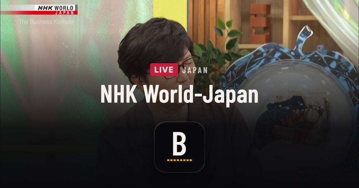
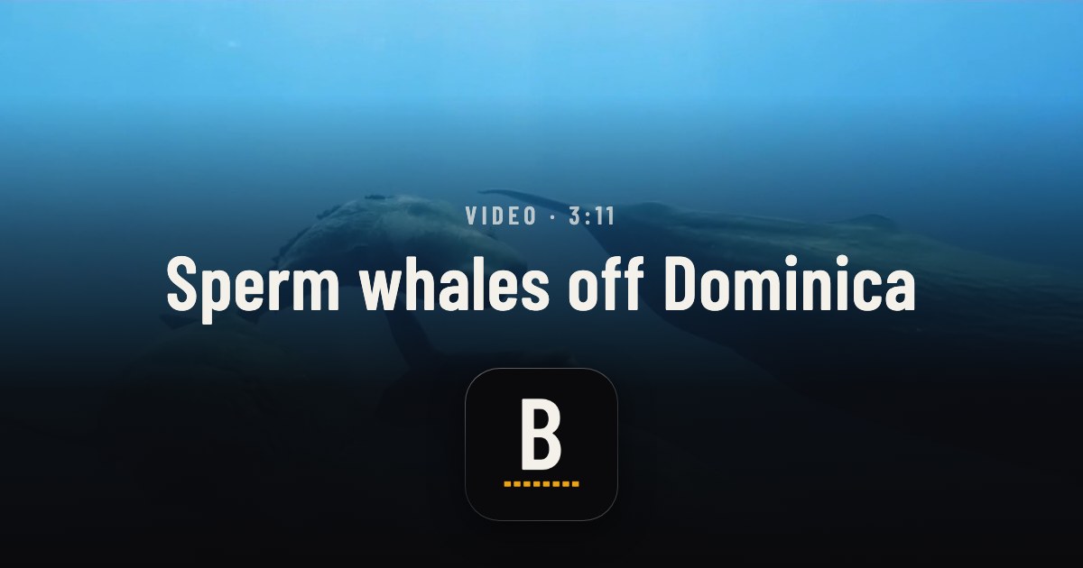
| Picture | A channel’s live frame or a video’s still, cover. A Room or creator: their photo, or their Byte mark when they have none |
|---|---|
| Fade | linear-gradient(180deg, rgba(10,10,12,0) 16.5%, rgba(10,10,12,.55) 41.5%, rgba(10,10,12,.94) 68.5%, #0A0A0C), raised to clear the 168px icon |
| Label | Barlow Condensed 28px, .18em, uppercase, paper .72. A channel: the LIVE pill and the country. A video: Video · 3:11 |
| Name | Barlow Condensed 84px, paper |
| Mark | The app icon, the real icon-1024.png at 168px (φ × 104, locked 2026-09-24), radius 37.8, 55px under the name, in place of the BYTESTREAM lockup. The byte stays eight bits |
| Edge | 1px, linear-gradient(160deg, rgba(255,255,255,.36) 0%, rgba(255,255,255,.17) 42%, rgba(255,255,255,.12) 62%, rgba(255,255,255,.25) 100%), radius 38.8. Never below 12%, so the tile never melts into the black |
| Shadow | 0 10px 39px rgba(0,0,0,.45) |
| No picture | The homepage, docs and style book use the BYTESTREAM + FREEDOM plate. A channel with no frame uses the homepage plate. A picture the page would not show (18+, gone, not out yet) gives the plain plate and the default title |
- A card per link. That needs a renderer (
@vercel/og) or cards made in advance; Jake approves any new package. - A source for channel frames, fresh enough to be honest.
- The privacy gate: every picture passes the page’s own rules (18+, gone, not out yet) before it goes in a card.
Full spec in design/patterns.md, Link card.
Today every link gets one 1200 × 630 PNG: BYTESTREAM on void, the LIVE pill above it, and FREEDOM in Morse under it in now. Channel and programme names go in the title tag.
| Size | 1200 × 630 PNG, served at https://bytestream.tv/og-card.png from public/og-card.png |
|---|---|
| Made by | node scripts/make-og-card.mjs. The word spans the card less 160px on each side at 0.12em tracking. The pill copies the in-app LIVE pill: 8 × 4 padding at 12px type, 4px corners. The Morse line is as wide as the word. |
| bytestream.tv | The og: and twitter: tags in app/+html.tsx: title Bytestream, description Live television from around the world., card summary_large_image |
| A channel link | /watch/:id is answered by api/watch.ts with src/share/ogCard.ts: the same picture, with the channel and programme in og:title |
| A video link | /v/<slug> (on staging) uses the video’s still when the video can be shown, and this card when it cannot (src/share/videoCard.ts) |
| Old path | /api/og redirects to the same PNG (vercel.json) |
A generic preview; each app draws its own frame around the picture and the tags.
| Homepage | This card. Title Bytestream. |
|---|---|
| A channel | This card; the channel in the title, from api/watch.ts. |
| A video | The video’s still, or this card (staging). |
| A Room or creator | No card of its own yet: the homepage card. |
| Docs | No picture: summary_large_image with no og:image. |
| This site | The card below. |
These stay until the locked card is built. Then channel, live, video and Room links move to the picture card, and the homepage, docs and style book keep the lockup plate.
The same plate with the LIVE pill swapped for the site’s name, since nothing here is live. node scripts/make-og-card.mjs --label "Style book" --out design-site/public/og-card.png makes it; scripts/design-site-build.mjs writes the title, description and card tags into every page.
Icons
Every icon the app draws, taken from the code. Three families: Ionicons for nearly everything, Material Community Icons for the theater masks, the Ambience lamp, like and dislike, and hide, and the Hype set, drawn for the live room. Colour follows state: paperDim at rest, paper under the pointer, now when on or chosen, void on an amber button.
An icon is a font glyph set at the size each call site passes: <Icon name size color> in src/ui/Icon.tsx. The line is part of the glyph, 32 units on a 512 grid, so it is always a sixteenth of the size: 1px at 16, 1.25px at 20. The rail uses 16, the phone tab bar 20, player controls 18 on a desktop and 22 on a phone. A control rests at 0.9 opacity and grows to 1.06 under the pointer over 120 ms (GlyphButton.tsx).
play-outlineWatch on the rail and the tab bar; Watch on a Guide row and the video page
15 · 16 · 20albums-outlineCategories on the rail
16list-outline / listGuide on the rail and the tab bar; Spotlight’s guide row; list view (filled when chosen)
16 · 20globe-outlineAtlas on the rail
16heart-outline / heartSaved, and the save control on the overlay, Guide, channel and video pages. Filled when saved
12 – 22search-outlineSearch on the rail and the tab bar, the search field, Spotlight
16 · 20desktop-outlineStudio on the rail; Share screen in a live room and on Go live
15 · 16 · 18notifications-outlineThe bell; an empty notification list
18 rail · 20 phone · 34person-outlineAccount; a missing avatar (half its size); Sign in; Pinned in a room
14 – 28ellipsis-horizontalAccount menu, more
16settings-outlineAccount menu, Settings
16options-outlineNotification settings
16log-out-outlineAccount menu, Sign out
16closeClose a panel, sheet or screen; clear a chip or a field
12 – 24arrow-backBack in notification settings, Go live and upload
14 · 16arrow-forwardThe end of a shelf, to the full list, in amber
22arrow-upThe upload drop zone, in amber
44 phone · 52 desktoparrow-undoThe last-channel pill
13chevron-backBack on browse pages, upload, Spotlight and Sideways; the previous page of a room grid
14 – 24chevron-forwardA row that opens a list; the next page of a room grid; a closed Atlas section
11 – 18chevron-downAn open Atlas section; the filter panel
18 · 22filter-outline / filterThe filter toggle, filled while open; the Sideways filter
15 · 16grid-outline / gridGrid and wide grid views; Everyone in a room
14 · 16apps-outline / appsDense grid view
16star-outline / starStarred countries in Atlas
18 · 20play / pausePlay and pause in the amber disc (half the disc); Play on a channel page
12 – 24refreshBack 15 and forward 15, mirrored for back with the numeral drawn on top; retry in Activity
20 · 22 · 26play-skip-back / play-skip-forwardPrevious and next channel
18 desktop · 22 phonevolume-high / volume-muteSound on and off
18 · 22expand / contractFullscreen and exit fullscreen
18 · 22language-outlineAudio language picker
18chatbox-ellipses-outlineCaptions picker
18share-outline / checkmarkShare; the checkmark once the link is copied
15 – 20phone-portrait-outlineA channel that plays only in the phone app
12 row · 14 cardtime-outlineRuntime on the video page
18eye-outlineView, in Activity
20videocam-outline / videocam-off-outlineCamera on and off: Go live, the join door, room controls, a camera-off tile
14 – 36mic-outline / mic-off-outlineMic on and off
14 – 19camera-reverse-outlineFlip the camera
15 – 19person-add-outlineInvite to the room
15 · 16exit-outlineLeave a room, as a guest
16 – 19lock-open-outlineOpen a creator’s channel (admin)
16alert-circle-outlineA Go live error
16shuffle-outlineYour picture: shuffle the mark
14push-outlineUpload a video in the Studio
14 · 22film-outlineA video with no still yet: notifications, creator moments, upload
12 · 14radio-outlineA live, in notifications
14drama-masksTheater mode, amber while on
18 · 22lamp-outline / lampAmbience, filled while on
18 · 22thumb-up-outline / thumb-upLike, on the Watch overlay and in the now-playing panel. Locked 2026-09-24
18 overlay · 20 panelthumb-down-outline / thumb-downDislike, on the Watch overlay and in the now-playing panel. Locked 2026-09-24
18 overlay · 20 paneleye-off-outline / eye-offHide a channel in the now-playing panel
20MaterialIcon in src/ui/Icon.tsx, for the masks and the lamp that Ionicons does not draw. Like and dislike are Material Community’s thumbs everywhere, locked 2026-09-24: OverlayThumb in src/screens/Watch.tsx and src/ui/NowPlaying.tsx.
hypeHype, the room control
15 – 21cheersCheers
15 – 21applauseApplause
15 – 21laughterLaughter
15 – 21hornAir horn
15 – 21wompWomp womp
15 – 21awwAww
15 – 21drumsDrums
15 – 21handAsk to speak
15 – 21Our own paths on a 24 grid, stroked at 1.5 with round caps and joins (src/live/hypeIconPaths.ts, drawn by HypeIcon.web.tsx). The room’s Hype and Ask to speak controls use the speaker and the hand from this set in place of Ionicons’ volume-medium-outline and hand-left-outline. The iOS and Android apps have no SVG renderer yet and draw the nearest Ionicons glyph instead (HypeIcon.tsx).
Cream line marks on two PNG sheets, six to a row at 256px a cell: assets/category-sprite.png for the nineteen parents in Watch order, assets/category-child-sprite.png for the children. CategoryIcon crops one cell and draws it at 48 by default.
Elsewhere in this book, a few specimens draw simpler stand-ins for these glyphs (a 1.8 line on a 24 grid). The glyphs on this page are the ones the app draws.